“Can you do a black kitchen?” Mario J. Mulea laughs as he recalls the first words the homeowner spoke to him. The homeowner had just stepped into the showroom for Kitchen Designs by Ken Kelly (kitchendesigns.com), a firm serving the Long Island area of New York where Mulea works as a kitchen designer. As an experienced interior designer herself, the homeowner had a clear vision of what she wanted to accomplish. That she sought Mulea’s help offers a clue into how specialized and complicated kitchen design can be.
The kitchen in the homeowner’s nearly-century-old Tudor was the final update that needed to be made to return the home to its former glory. In Mulea, she found a kindred spirit who appreciated the history of her home and believed it should inform and inspire the design. “I always talk about the house first,” he says, describing his design process. “What’s the style of the house? What neighborhood is it in? Do the interiors match the architecture? If you have a center-hall colonial and you ask for cobalt-blue, high-gloss cabinets, I’ll tell you that you’ve picked the wrong designer. I’m not going to do that.”
The kitchen in the homeowner’s nearly-century-old Tudor was the final update that needed to be made to return the home to its former glory. In Mulea, she found a kindred spirit who appreciated the history of her home and believed it should inform and inspire the design. “I always talk about the house first,” he says, describing his design process. “What’s the style of the house? What neighborhood is it in? Do the interiors match the architecture? If you have a center-hall colonial and you ask for cobalt-blue, high-gloss cabinets, I’ll tell you that you’ve picked the wrong designer. I’m not going to do that.”

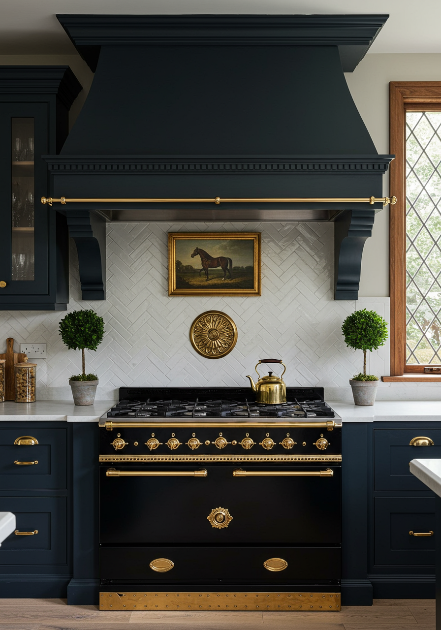
With pickled maple cabinets, green Formica countertops, and vinyl flooring, nothing about the kitchen matched the home’s Tudor style. Respecting that architecture necessarily constrained the design. Windows, doors, and a radiator could not be moved. Another design constraint, which would ultimately become the room’s centerpiece, was a wish-list purchase by the homeowner. “She absolutely had to have the La Cornue CornuFé range,” Mulea recalls.
After the must-go, must-stay, and must-add items were defined, Mulea’s next questions revolved around how the room would be used. “I talk with clients about how their family uses the kitchen and how they use it when they have visitors,” he says. “We discuss zones and how kitchens work.” He notes that the “work triangle” notion is now outdated for most modern homes. It’s more helpful to know how homeowners actually use the space and what traffic flows in and out of the room.
Once all the information is gathered, Mulea starts sketching possible ideas. That’s the creative side of the process, but it’s paired with more analytical considerations. “A kitchen is both a giant jigsaw puzzle and a math problem,” he explains. Once you know window and door positions and appliance sizes, you then have to figure out the best way for cabinets, islands, and countertops to fill the room’s envelope. Every available inch of space in this kitchen is put to use.
Respecting the home’s history meant choosing materials that seemed contemporaneous. “The materials you use don’t have to be historic, as if they’ve been there for one hundred years. The critical thing that makes a kitchen timeless is integrating it into the fabric of the rest of the house,” says Mulea. The distressed finish of the black cabinets is one such example. Handscraped hickory floors with black distressing also add a patina of history to the room.

The black La Cornue range with brass trim serves as a centerpiece. Other appliances were clad in cabinet panels so they would not distract from the showpiece. The mantel hood arches over the range and an English foxhunt print rests on its ledge.
No detail was overlooked during the remodel. The diamond angles of the white-tile backsplash match the angles in the room’s windows and leaded-glass cabinet fronts. A fireplace back hangs behind the range and looks like a reproduction from the Victorian era. In a corner of the room, a new door with a ring pull was added to the home’s original milk delivery box. A copper sink serves the wet bar off to the side of the room. The same wet bar camouflages the room’s radiator, which sits behind a lattice door and vented toe kicks that allow air circulation. Practical quartz counters top the perimeter cabinets, while walnut slabs cover the wet bar and island.
The homeowner added her own special design touches throughout the space, too. She discovered the vintage chandelier, which now hangs over the island, in an antique store and had it rewired. The wallpaper was her request, and the plaid-covered stools with brass nailheads were one of her finds. On a trip to England, she gathered many of the teapots, crystal, and curios on display behind the glass-fronted cabinets.
The surfaces in the kitchen exude Old-World charm, but beneath them lies functionality. A tug on custom brass hardware reveals deep pot drawers, appliance garages, an ice dispenser, and a trash bin.
The end result is a kitchen that looks like it could have been there from the home’s beginning, but incorporates all the modern needs for today’s family. “If you look at my portfolio, you’ll see I do not have a signature design,” says Mulea. “To me, my signature is that the design must fit the house and the people who live there above everything else.”


