“The home has history,” says designer Lindsay Vieira. “And with it, there’s a certain level of architectural details and character that makes it one of a kind.” So when the designer’s soon-to-be clients were searching for a home in Boston’s historic Beacon Hill—an area notorious for very little inventory and high demand—and finally found one that checked all the boxes in terms of design, they were thrilled. “The home just has some beautiful architectural features that we immediately fell in love with,” says the homeowner.
The circa-1825 home is classic Beacon Hill: a stunning combination of Federal, Italianate, and Second Empire architecture. It was converted in 1948 into ten single apartments, and most recently brought down to just four larger luxury condos. Just as the drywall was going up on the renovation, the homeowners swooped in and grabbed one of the 2,000-square-foot condos for their family of four. “We were extremely lucky to find it!” says the homeowner. Getting in so early in the renovation process allowed them the option of customizing the home with finishes, paint, and more—an opportunity that was not lost on them. “We knew we really wanted to do something different and more modern in this home,” says the homeowner. “So getting in on the design process early was key.”
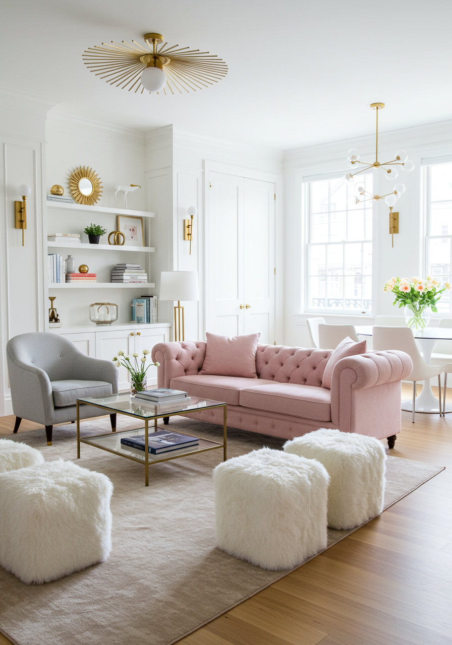
They also knew that they had to capitalize on every square inch of the home. “We had to treat it like a boat,” says the homeowner. “Storage everywhere was a must.” So they enlisted the help of Renovation Planning & Interiors, who had assisted the couple in designing custom built-in shelves for their previous residence. It was Vieira, the company’s director of interior design, who was tasked with designing the custom built-ins by Keynon Woodworking in the open living room to add more storage and streamline the look of the space.
From there, though, the scope of the project expanded and the homeowners looked to Vieira to pull together a cohesive design that allowed the home’s original architectural details to shine but was also fresh, clean, and skewed a touch midcentury modern. The inspiration started simply with a Jonathan Adler sofa swathed in a blush-pink Romo fabric. “I just knew that I wanted a pink couch,” says the homeowner, laughing, who purchased the piece prior to Vieira’s involvement. But the homeowner’s taste in the midcentury modern–inspired sofa aligned perfectly with the designer’s style, resulting in a complementary pairing that would extend throughout the design process.
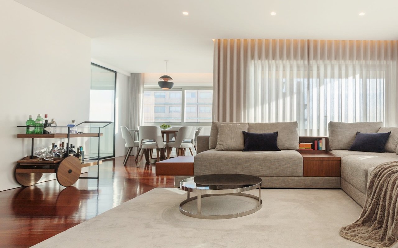
“Lindsay is young and her style is so fun,” says the homeowner. “We had a lot of heirloom pieces and antiques, so I didn’t want this modern space to feel like Grandma’s house. Lindsay was really able to transition those pieces into the home with other more contemporary items to make it feel less traditional and a lot more modern.” The space itself was not contemporary, so Vieira balanced pieces such as the antique chest in the living room with more modern pieces such as the pair of Lucite-and-brass coffee tables by Jonathan Adler and ottomans swathed in a fuzzy white shag by Mitchell Gold + Bob Williams. The custom Nancy Corzine swan throw pillows are a nod to neighboring Boston Commons, a park known for its swimming swans.
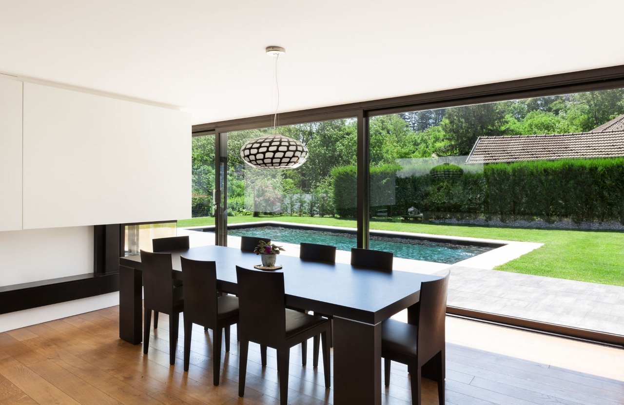
The adjacent breakfast area skews midcentury modern as well, with the classic white Eero Saarinen marble-top dining table and sunburst chandelier by Arteriors. “These are very sharp pieces that really balance out the antiques,” says Vieira. “[The style] naturally lightens up the antiques and softens the entire space . . .”The same approach was taken in the master bedroom, which had a unique up-lit niche behind the bed. “This was a very challenging piece to design because it’s so contemporary; and while my clients wanted a touch of that, they didn’t want it to overwhelm the space,” says Vieira. So the designer balanced it with a traditional wallcovering by Mary McDonald for Schumacher by wrapping it into the niche and not just around the outside. The addition of bedside tables with clean lines and storage to boot helped round out the look of the bedroom. The walk-in closets in the master were also redesigned by Renovation Planning & Interiors with woodworking again by Keynon Woodworking, allowing for ample, much-needed storage.
Even though the homeowners were slightly worried about the lack of square footage, they knew it would just take a designer with a vision for both practicality and classic design to make it work. “Lindsay can find a needle in a haystack to make a design come together,” says the homeowner. “She really made this work.” She assisted the couple in designing custom built-in shelves for their previous residence. It was Vieira, the company’s director of interior design, who was tasked with designing the custom built-ins by Keynon Woodworking in the open living room to add more storage and streamline the look of the space.
